InfraFoundry
Our Logo
Every element of our logo was chosen to say something about how we work.
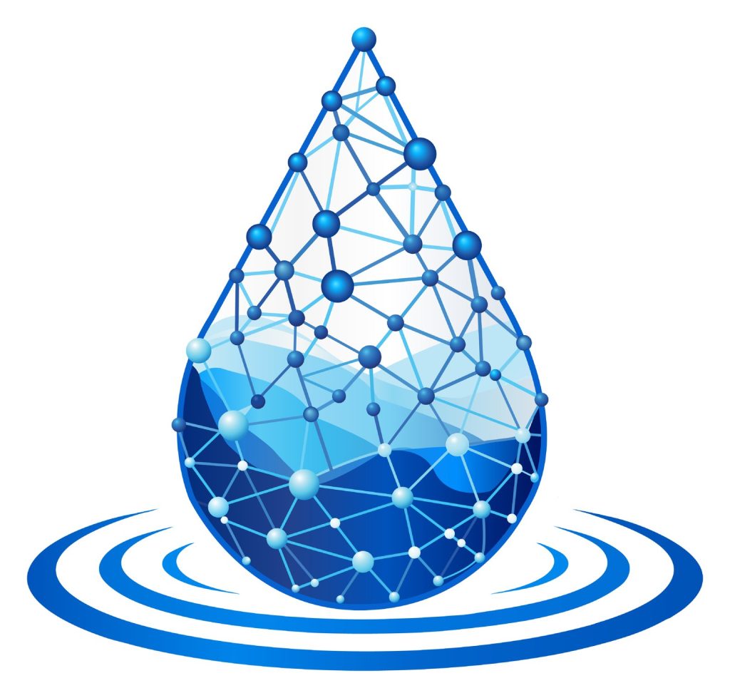
A network, shaped like a drop of water
Our logo is a droplet built entirely from a connected network of points and lines. The network represents how we work: the people, organizations, and ideas that only create value when they are connected to one another.
From open network to solid foundation
The logo moves from a light, open lattice at the top to a deep, solid blue at the base. It mirrors the way we work — starting from a wide view of a client’s options and relationships, and bringing that thinking down to something solid, grounded, and actionable.
Ripples: the impact that follows
The rings beneath the droplet are the impact that spreads outward once the right connections are made — the same idea captured in our tagline: experience, relationships, and ideas, forged into impact.
A network of connections that sends its effect outward. That is the idea behind Infrastructure Foundry — and behind our mark.